When thinking of web design the term design can be relatively vague. The reason being that much of web design consist of strategy, including everything from content writing and text arrangement to design appearance and representation. When all of the different elements of web design come together correctly it creates a website that is visually appealing as well as accessible and practical to all users.
It is no small task putting all of these elements together, and in doing so you need to have a plan. Establishing a plan will allow you to focus on your objectives and work towards them accordingly.
The Master Plan to a Prosperous Website
1. Set Up Your Objectives
The very first thing to do when approaching a website is to figure out the key objectives and goals to be accomplished within the site. Ideally you want to know exactly what it is that you are trying to achieve with a new website. If you are unsure of the key purpose you may want to consult with others around you for help in order to come to a clear decision. Not knowing exactly what you are aiming to achieve may lead you down a long dark alley and in the end provide no potential benefit.
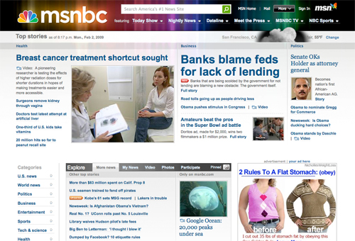
2. Recognize Your Clientele
Determining who will visit your website will greatly affect how you should approach your design. In recognizing your clientele you need to take into consideration age, sex, occupation, and internet comprehension. Pay attention to what visitors are going to be looking for and how they will be using the site. Designing a website around how users will use it rather than attempting to conform users will produce greater results. For example a website about trendy celebrity gossip is going to take a much different look and feel than a website about technical computer hardware.
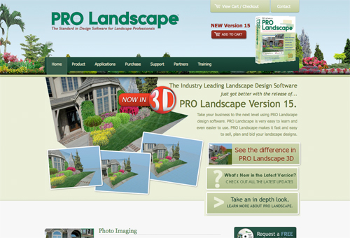
3. Decide Your Identity
Select a brand and identity that works for you and stick to it. It is easy to get carried away with colors, images, fonts, and the alike but remember that you are representing a brand, and in doing so you need to maintain a look and feel. Take into consideration how you want your brand to be portrayed and how you want visitors to feel when visiting your site. Your identity needs to symbolize your personality and character, make sure that it is always fitting.
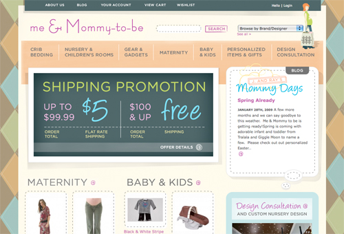
4. Use a Motivating Design
After you have set up your objectives, recognized your clientele, and decided your identity it is time to put all of these into motion with a motivating design. Your design needs to be crafted around all of these elements in a way that it is not only fitting to your identity and clientele but also in a way that it will produce results. Implementing design what will push users to a desired result will work towards meeting your objectives, and doing so it will allow your design to run hand in hand with your master plan.
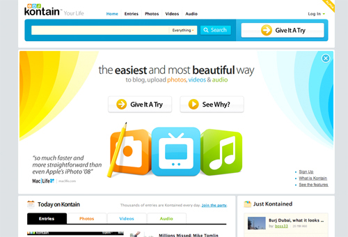
5. Evaluate Outcome
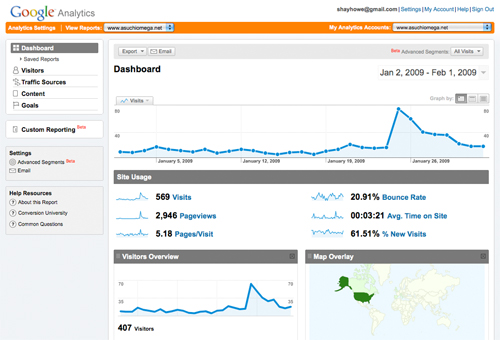
After everything has been put together and your website has been up and running you want to evaluate the outcome. Go back and look at your main objectives, did you accomplish them? Have you noticed any patterns? Have you gained any quality feedback? Knowing exactly how successful, or unsuccessful, the site is will allow you to work toward continually improving it.
6. Continually Progress
No matter what you can always continually progress your website. Looking at your evaluated outcome, statistics, and other measurements it is easy to identify areas of concern. Perhaps users are having a hard time finding your phone number or maybe the form submit button is not easily recognized. Continually making progressive improvements and upgrades will make your website more successful at accomplishing its goal.
Fundamentals of Successful Web Design
Websites are not carnivals, therefore they should not be treated as such. A lot of people approach websites with the idea of having a flashy and dazzling interface, complete with all of the latest bells and whistles. Truth be told this is inefficient. Users are after usability and utility of a website, not the visual layout and design. Designing websites around the user (also called user-centric design) has become the leading approach for prosperous and productive websites. At the end of the day, if users can not use your website it might as well not exist.
1. Follow Your Objectives
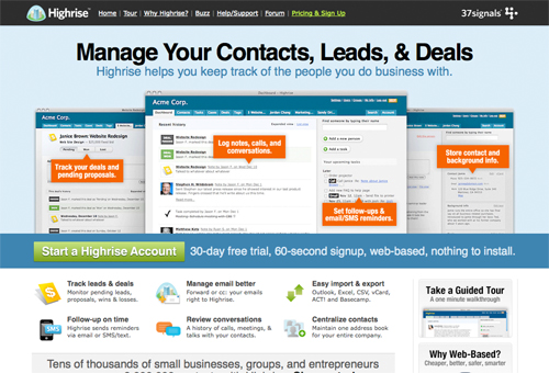
Earlier I mentioned setting up your objectives as well as using a motivating design, now its time to truly follow these objectives through your layout and design. When a user gets to your site they found their way there for a reason and now its your turn to walk them through the site effectively. In doing so you are going to want to draw the attention of the customer, raise customer interest by promoting strong points and benefits, convince customers that they want and desire your service or product and that it will fulfill their necessity, and lastly you need to guide customers towards taking action or making a purchase.
2. Eliminate User Thinking
Eliminating user thinking reduces the chances of them leaving your website. Typically if a user is confused or can not find the answers they are looking for they will pounce on the back button. It is to your best interest to eliminate any potential questions a user may have when browsing your site and keep it as clear and evident as possible.
3. Minimize User Requirements
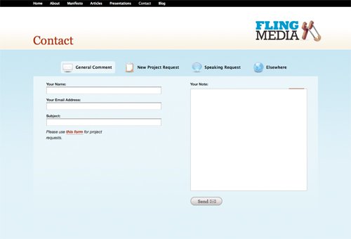
The last thing any user wants to do is fill out a long contact form or read extensive blocks of content. Minimizing user requirements will keep them happy and their patience intact. Remove as many obstacles as possible and keep things short and sweet when practical. Keep in mind the less action required from a user the more willing they are.
4. Keep Users Focused
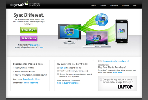
Whenever a user begins to lose focus and interest they are more likely to leave your website. Keeping users focused is accomplished by using easily recognizable edges, patterns, and motions. Using a variety of text and images you want to guide your users from point A to point B with out them actually thinking about what they are doing. The less thinking they have to do the better attitude they have towards continuing through the website.
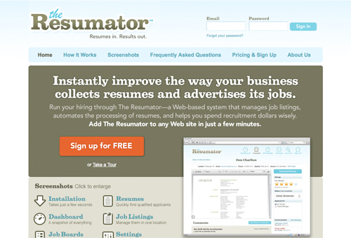
5. Use Prominent Coverage
Using prominent coverage and placement of large buttons and visual ques helps to lead users through the site. Offering steps, including 1-2-3 steps, help to guide users in a very straight forward and pleasant way. Making sure that the website is clearly understood is one way to allow users to feel at home with the website and comprehensibly notices the features at hand.
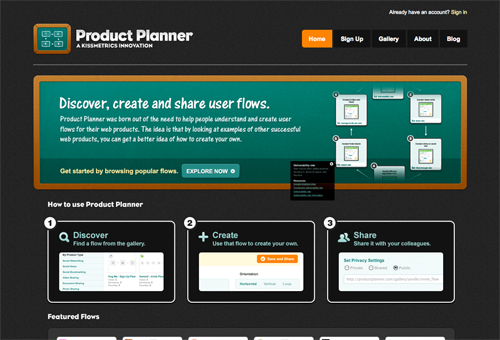
6. Use Text Captivating
One thing to keep in mind when developing text for a website is to understand the difference between web and print writing styles. On the web users do not read, they scan. Excessive text without any images will be skipped and large portions of bold or italic text will be disregarded. You want to get to the point as quickly as possible and stay away from any language that may be considered endearing. For example, using the word “Search” is typically than using the word “Go” on a button for the fact that it is more descriptive and easily understood. Clear, distinct, and plain text work the best, especially within a easily browsed layout.
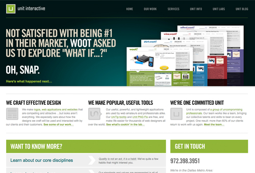
7. Keep It Simple
When users are surfing the internet they are rarely looking around for pretty designs, what they are looking for is information and details related to a specific topic. One of the most important thing to keep in mind while designing a site is to keep it simple. Loading up your website with unnecessary graphics and advertisements will only frustrate users, while using plain objective text strictly related to what the user is looking for will work the best. Work towards clear and clean designs over elaborate designs.

8. Reduce Numerous Colors
Dark text on a light background and light text on a dark background work well together as they are submissive and easy to read. Using energetic colors in and around this text allows you to draw attention to special features. It is important however to keep these energetic colors to a minimal and use them in a compelling manner. Doing so keeps it easier focus users attention and draw them to the most prominent areas of the website.
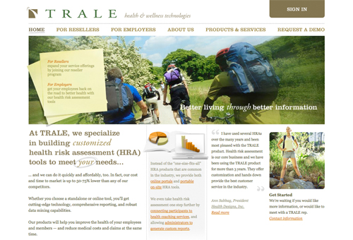
9. Highlight White Space
One of the first things a user does when they reach a website is scan the layout and design looking for areas upon which they can divide the content into comprehensible parts. While using white space you are able break up the layout for them and decrease the perception of the amount of text. It has been proven that larger compositions of text are more difficult to understand and in result turn off visitors. Using white space, even over a horizontal rule, will assist in building a apprehensive website.
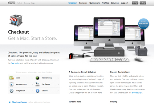
10. Aim for Balance
Balance within web design is powerful because it provides users with a perception of closure and allows them to visually see what is considered the most important and the least important. Creating a balance allows things to be displayed in order of important and thus is easier to take in and make decisions. A popular trend amongst the web design industry is building grid-based layouts, of which is extremely helpful for attaining balance withing a layout.
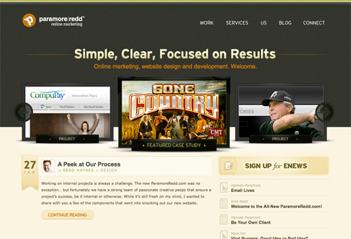
11. Use Visually Organized Text
The significance of text is not only measure by its captivation but also by its visual layout. When working with text you want to keep a consistent and well organized structure from page to page in order to keep users focused. Within your text you want to be clear and distinctive using the least amount of text as possible. Users want all of the details however they do not have the time or patience to read ambiguous content. Lastly, you need to present the text effectively within the layout keeping in mind balance, color, font, size, and overall legibility. A best practice is to use a maximum of 3 font faces and 3 font sizes.
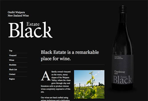
12. Follow Standard Conventions
As the saying goes, let’s not reinvent the wheel. A lot of times we see websites that try to push the limit and do innovative things, and while this may work some of the time it is better to follow standard conventions unless you truly have a great idea. Going off on your own innovation can be complicated and confuse users. User are used to conventions and will look for them within your website, not providing these conventions can cause users to loose trust, assurance, and reliance - ultimately driving them away from your website.
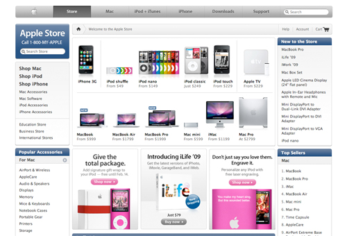
13. Push for Definition
When all said and done you want your website to be as clear and concise as possible. This allows users to quickly find what they are looking for or complete a desired call to action. Any roadblocks or confusion along the way will simply slow them down. Accomplishing a high level of definition is completed within the layout and design. Keep the appearance of your website pristine, easily navigated, and consistent throughout all the pages. Make sure that there is no way anyone could mistake your layout and design.
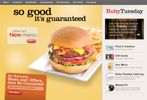
14. Clarify User Necessities
The best way to see great results is to ease your visitor and make them feel relaxed. The best way to relax your visitor is to clarify their necessities and work around them. Take a look at your traffic, or potential traffic, and think about what will make your website better, easier to use, and more coherent for them. This could include shortcuts, search features, bookmarking options, or even printing preferences.
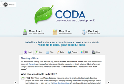
15. Study and Experiment
Testing a website is probably the biggest disappointment when it comes to web design. More times than none designers and developers neglect this process and move on to their next assignment. Fact of the matter is running one user through a website for feedback is better than none at all. Studying and experimenting with your website will always produce useful results. It is also convenient to study and experiment at multiple stages of the design and development process, gaining beneficial feedback through the entire process.
Resources
Additional resource links to books, blogs, and free website templates. All of which can be a trenendous help during the design and development of any website.
Books
- Beginning CSS Web Development: From Novice to Professional by Simon Collison
- Build Your Own Website The Right Way Using HTML & CSS by Ian Lloyd
- Bulletproof Web Design by Dan Cederholm
- CSS Mastery: Advanced Web Standards Solutions by Andy Budd
- Designing with Web Standards by Jeffrey Zeldman
- Don’t Make Me Think: A Common Sense Approach to Web Usability by Steve Krug
- Killer Web Content: Make the Sale, Deliver the Service, Build the Brand by Gerry McGovern
- Web Standards Solutions: The Markup and Style Handbook by Dan Cederholm
- The Zen of CSS Design: Visual Enlightenment for the Web by Dave Shea
Blogs
- www.alistapart.com
- www.css-tricks.com
- www.nettuts.com
- www.smashingmagazine.com
- www.webdesignledger.com
- www.wefunction.com
Free Website Templates
- Open Design Community - www.opendesigns.org
- Open Source Web Design - www.oswd.org
- Open Web Design - www.openwebdesign.org
Are you a manager? Looking to actively engage with your employees?
Let Lead Honestly help get the conversation started by sending you five questions to ask your employees 1-on-1 every week.
Be a Better Leader