Landing pages are specially crafted web pages aimed at convincing visitors to take a specific action, and overall increase conversions. These actions can include making a purchase, filling out a contact form, signing up for a newsletter, downloading an application, or so forth.
Perfecting a landing page takes time. A few instructions and suggestions to keep in mind when designing and perfecting a landing page include:
Give your landing page a unique layout and design, separate from the original website.
This is perhaps the most important step. Stripping away some of the features from a full site has proven to increase conversions by not allowing visitors to have any option but to perform the desired action.
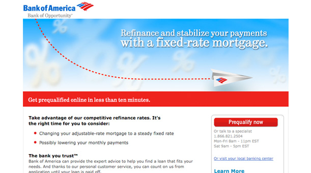
Be aware of, and address, visitor’s questions.
Landing pages need to be visually attractive and look trustworthy - not discouraging visitors in any way. Make sure the page is what the visitors are looking for and are able to hold their interest. Finally make sure the page has a clean and clear way of allowing users to complete the desired action, and if a user is uncomfortable there needs to be a way for them to contact you or obtain additional information if need be.
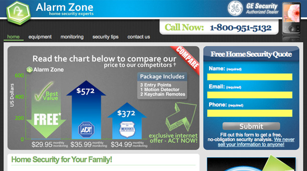
Strategy, goals, and tracking.
Behind every landing page there needs to be a business strategy and goals. Knowing these strategies and goals will make it easier to design the page. Furthermore set up goal tracking on your landing page to measure the conversion rate. This will tell you if you are doing something right or wrong and provide an insight on how to improve.

Complete the entire conversion process, and quickly.
With a typical landing page you have one chance to obtain a conversion from a visitor. This needs to be done quickly before the user loses interest, however you also need to complete the entire process. Taking a visitor through a lengthy drawn out process increases the chances of them getting frustrated leaving the page.
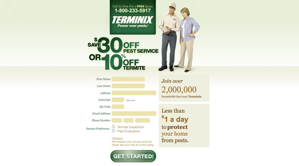
Run advertisements and build links to the landing page.
Ideally a landing page will have a good amount of first time visitors to the page. This comes from running paid advertisements and building links to the page. Make sure your page can answer and address all of these first time users to increase conversions.
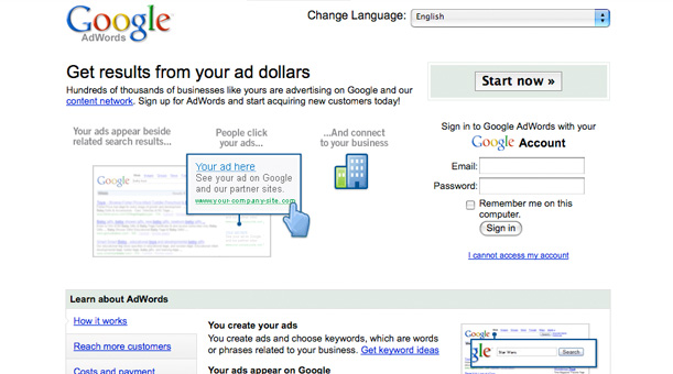
Build a positive reputation with practical design.
Users will judge a web page within seconds of viewing it. This is why it is important to use a layout and design that is not only professional but also fitting with the industry. Take in to consideration your competitors landing pages, is your page better and easier to use?
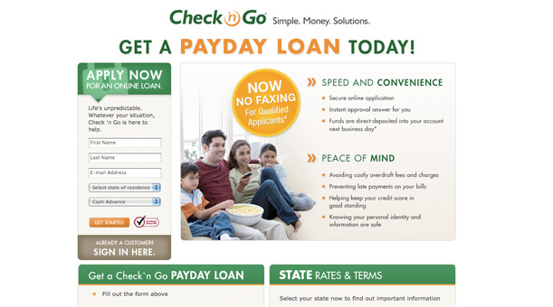
Portray trust with references and awards.
Reviews, testimonials, awards, certifications, and other references often persuade users. Perhaps some of the most popular ones include Better Business Member and VeriSign Secure (hacker safe/tested)._ Use these references wisely_ selecting specific ones for the target audience and do not let them take over the page.
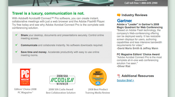
Clarify and clean the layout.
It is important to build landing pages separately from the original sites layout and design. In doing so you want to lighten the header, navigation, and other external links. This eliminates all the distractions and focuses the user’s attention on the call to action.
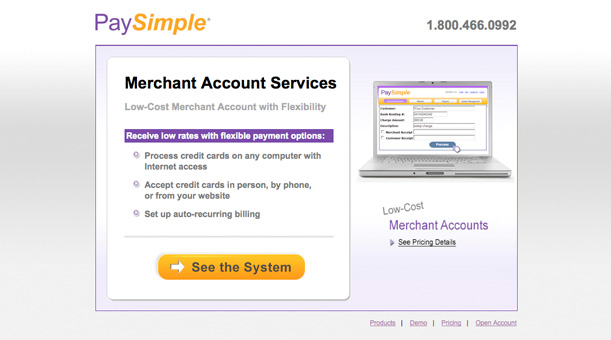
Minimize branding and original site detail.
The most important part of a landing page is to obtain a conversion, building branding and identity come secondary. While it is important to keep some branding for recognition and credibility purposes the main goal is to keep users focused on the call to action.
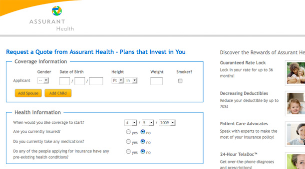
Simplify or remove navigation.
By simplifying or removing the navigation you are giving users less of an opportunity to leave your page and more of a reason to complete the call to action. Make it clear what you want from a visitor in order to complete the call to action and move forward, however do not go too far and leave them no choice but to complete the call to action. Offering supportive and back up materials behind the call to action is also important.
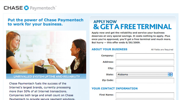
Develop ad on landing page.
If you are linking to the landing page from an advertisement make the landing page supplementary to this ad. Do not build a landing page template and use it over and over again, especially if it does not match the ad.
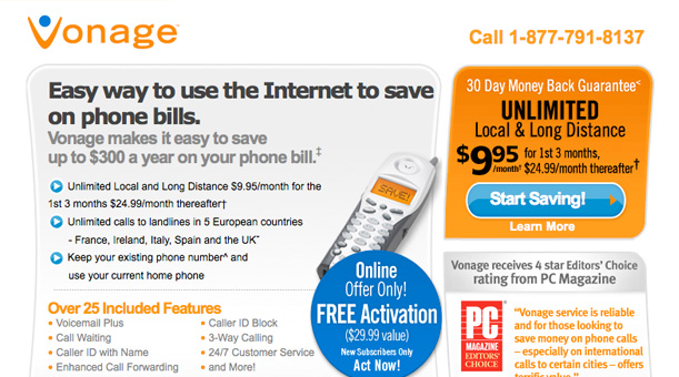
Stay consistent with the ad offer.
Be sure that the landing page offers the same thing as the ad. If the ad is promoting free food and the landing page is only offering a 10% off coupon you immediately lost a visitor, as well as embarrassed yourself.
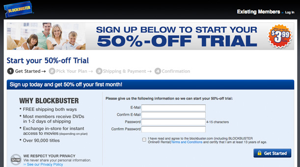
Use the ads call to action within the landing page.
Repeat the ads call to action on the landing page. If an ad promotes “Free Shipping” use the same expression on the landing page, for example “Receive Free Shipping On All Orders Through Friday!” Any inconsistency between the ad and the landing page will create uncertainty and suspicion among users.
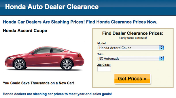
Use the right amount of effective images and media.
Images, and media in general, can have a strong effect on users in both good and negative ways. Too many images can annoy and disturb users making them lose focus on the call to action. However, the right images can lead users directly to the call to action.
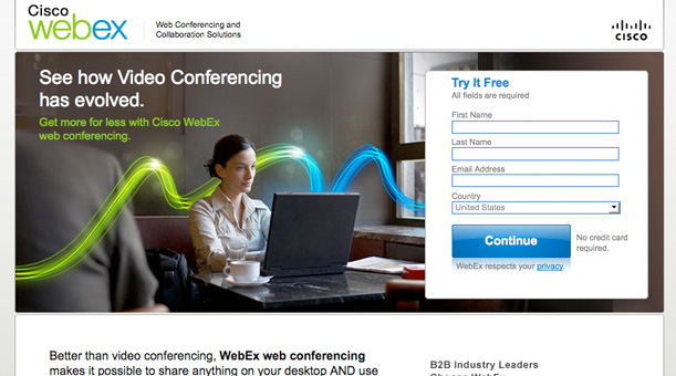
Sustain individualized vocabulary and character.
Landing pages content should speak the same language and maintain the same tone of that recognizable to the target user. Using vocabulary over or under a user’s vocabulary will push them away from the desired action. Addressing users directly will help with personalizing content for a target audience, for example using the following heading “Phoenix, Arizona Home Builders”.
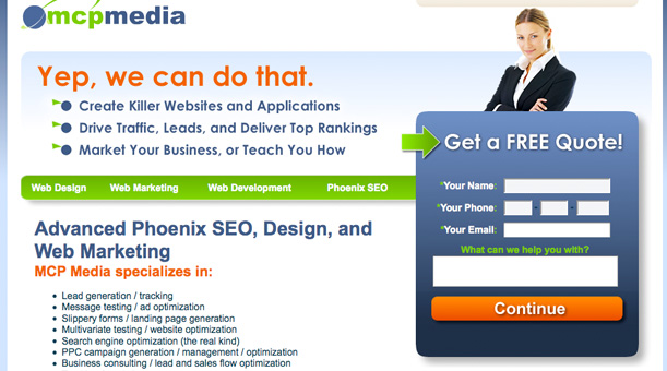
Segregate different users.
When targeting many different keywords it is entirely possible that you are looking at many different audiences. Segregating these users into different groups from the start will increase conversions down the road. For example a computer company might segregate users in to home, office, and networking.
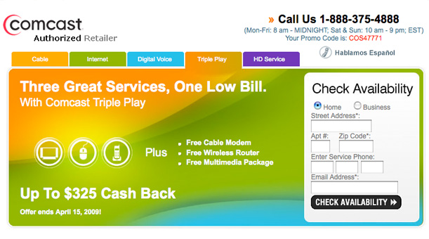
Assemble curiosity and impulse with captivation copy.
Outlining and providing facts behind an offer are of great importance. Sparking a personal interest or impulse within a user however will allow users to defeat indecision.
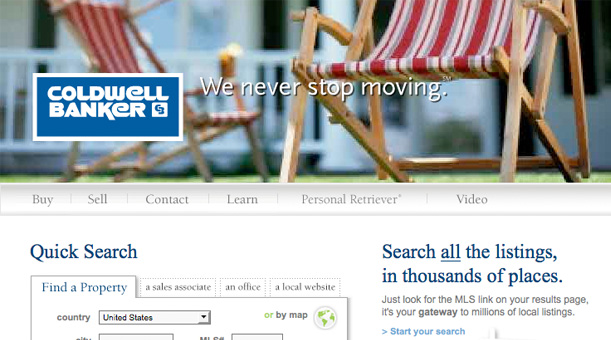
Capture user interest with insurance and justification they can relate to.
Similar to providing references on a landing page, insurance and justification users can relate to will also increase conversions. Point out exactly what a user can potentially benefit from or miss out on.
Confirm copy, only highlighting necessary content.
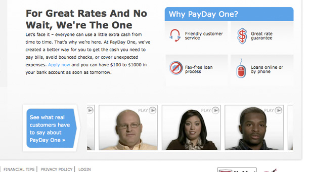
It is important to not boggle down users with too much content. If your offer is small and to the point keep the content small and to the point. If your offer is more in detail provide a detailed explanation using descriptions, testimonials, and examples if need be. Landing pages have a restricted amount of space and users are anxious, get to the point quickly and supply only the most important information.
Use an understandable call to action.
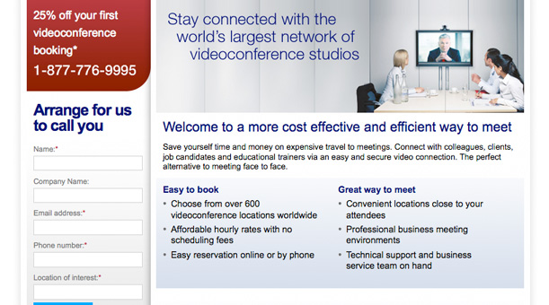
The call to action is the most important part of a landing page, without it there is no need for a landing page. Make this section of the page perfectly understandable and easy to use. Show the visitor where to go and what to do when they get there, no surprises.
Escape hassling and pressuring text.
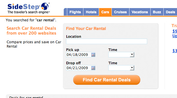
Often times text on landing pages can be too hassling or too pressuring, and in result scaring users away. Use text that is friendly, not too vague and not too long. A few bad text examples include: Buy Now, Go, and Start.
Be aware of all reading types.
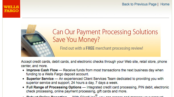
Users browse the internet in many different ways, some looking at only images while some read every word. Cover all of your bases by including at least one supporting image and well-documented text. Make use of headings, bulleted list, bold text, and colors (all within reason) to make more important information stand out accordingly.
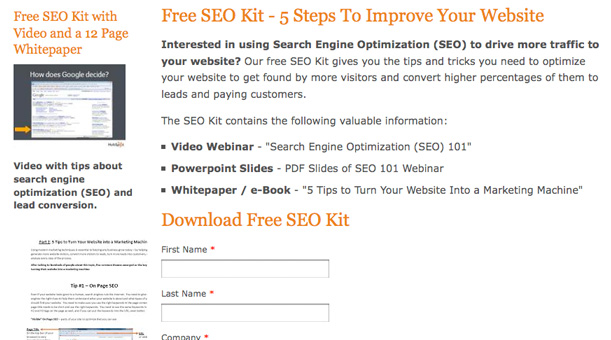
Offer subsidiary call to action.
Many times users are not ready to commit to the primary call to action, for this it is important to offer a subsidiary call to action. The subsidiary call to action can be as simple as a phone number or live chat, anything to interact with the user and offer them more information.
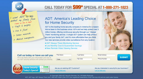
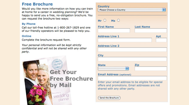
Keep form input minimal and design uncomplicated.
Minimizing the amount of input needed to complete a form will immensely increase the rate of conversions. When creating a form determine what is really important to acquire from users and what can be omitted. Be sure to obtain enough information so that you are not following dead leads; however do not ask for too much information and frustrate users.
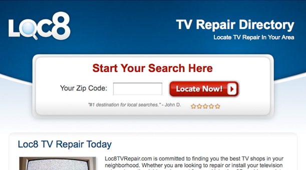
Make buttons distinguishable and in instinctual placement.
Buttons are the instrument as to how users take action, therefore they need to be distinguishable and in instinctual placement. The buttons need to look like buttons (not like hyperlinks), large enough to understand and placed in comprehensible places. If you have more than one button on a landing page, make the most important button the most prominent.

Utilize plain and evident labels.
When creating buttons you want to use simple and encouraging labels. Make the labels distinctive, inspiring, and repeat the call to action if feasible. A good label would include “Get Free Download”.
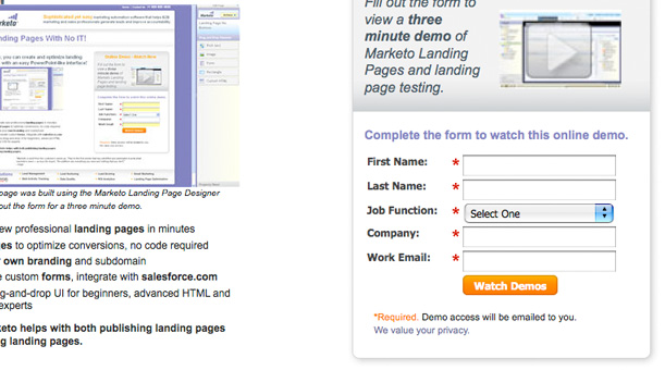
Provide insight to what happens after call to action.
Users want to know what will happen after the call to action. Giving the users insight as to what is to come has proven to increase conversion rates. If the landing page requires multiple steps outline these steps from the beginning, do not keep the users in the blind.
Are you a manager? Looking to actively engage with your employees?
Let Lead Honestly help get the conversation started by sending you five questions to ask your employees 1-on-1 every week.
Be a Better Leader