Home pages are typically seen as the bread and butter for most organizations, however most of these “bread and butter” pages have appalling visitor statistics. The average abandonment rate is around 40% - 60% and this rate trickles down affecting the rest of the site. A little work to a home page can go a long way increasing goals and conversions along the way.
We are all taught to never judge a book by its cover and unfortunately this does not play into web design. Within a matter of seconds visitors will decide if your site is what they are looking for and if not they will quickly move on. When designing a home page take the following recommendations into consideration to drive traffic past the home page and increase goals and conversions.
Capture a wide audience.
Home pages must be attractive to everyone. This includes customers, the media, shareholders, colleagues, employees, and etc. It is of value to address all of these audiences without turning the home page into a tangled mess. Not addressing or confusing any audience will push them to abandon the page. (For targeting specific audiences see part 1 of this series about landing pages.)
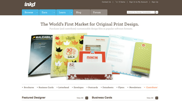
Be aware of, and address, visitor’s questions.
When a visitor comes to your site they are there for a reason. It is your job to know why visitors are coming to your site and exactly what they are looking for. A few questions to address on your home page may include: Is this what I anticipated? Is this site reliable? What does this organization do? Does this site provide what I need? What do I do next? How do I contact the organization or get more details?
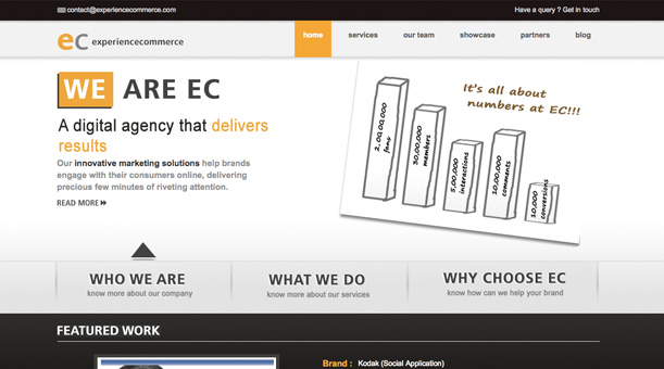
Measure the grade of traffic.
Not all traffic is of the same grade. For example organic keyword traffic is going to produce more conversions than inbound links from irrelevant pages. A large population of traffic from an inadequate source will decrease conversions. Measure your traffic grade for an insight to what actually works and will increase conversions.
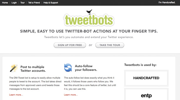
Highly managed and controlled.
Home pages are often the direct work and ideas of the CEO or president and therefore may be difficult to change without quite a bit of resistance. Before purposing any changes to a home page it is always best to have your suggestions well analyzed and backed with intelligent data. Make it difficult to be turned down based on the data alone.
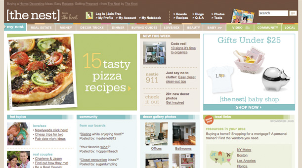
Use a solid foundation.
A good solid foundation for any home page starts with meeting any presumptions visitors may have followed up by having a captivating copy and a clear call to action. Without getting in too much detail, be sure to have a way to obtain leads or conversions from your home page. Not everyone will be looking for this, but it will never hurt.
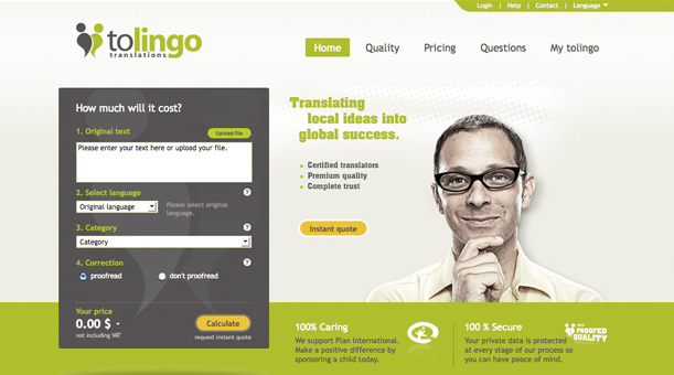
Install trustworthiness.
When a visitor lands on a home page it takes them fractions of a second to decide if the site is worth their time or not. This decision is influenced by the look and feel of the site as well as the trustworthiness it installs. If a person is researching lung cancer and lands on a page looking like a NASCAR website chances are they will leave almost (if not) immediately.
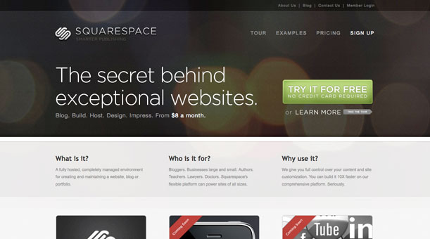
Visually establish branding and identity.
Apart from using a logo for identity it is important to continue developing the brand throughout the entire page. This can be accomplished by using identical fonts, colors, imagery, and so forth. Reminding visitors of where they are and keeping a consistent feel throughout will decrease bounces.

Use a comprehensible logo.
Many times logos are altered to make up for spacing or sizing within a web page, and doing so can make the logos difficult to read or understand. Use a comprehensible and readable logo placed in a visual pleasing location (the most popular location is top left corner, and for a good reason). Remember a logo does not do any good if no one can see or understand it.
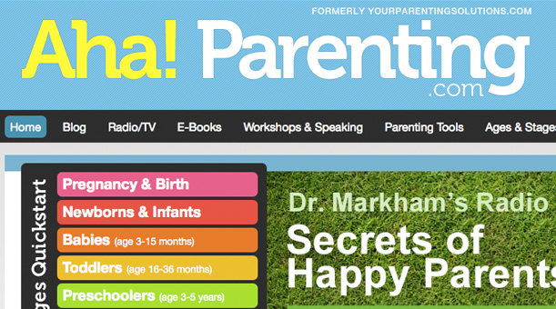
Make use of a practical tagline.
It is not uncommon for a logo to be ambiguous as to what the organization really does. For this a tagline would be a perfect place to provide a quick insight. Even if you feel the logo is clear enough a tagline may often provide some much needed assurance.
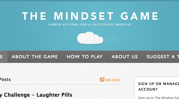
Promote key elements.
The home page is the perfect page to highlight what visitors want to see. Do not beat around the bush and frustrate visitors, direct them to what key elements are. It could be a featured product, promotional sale, or popular articles, just be sure that it stands out and is easy to distinguish.

Provide what users want to see.
Typically visitors are coming to your page for a specific reason. If you are able to predict this reason and direct them in the right way you will be ahead of the game. Some of the most regularly things looked for include: Top selling and most popular products, highly advertised goods or services, access to detailed information, methods of contact, support information, or how to login.
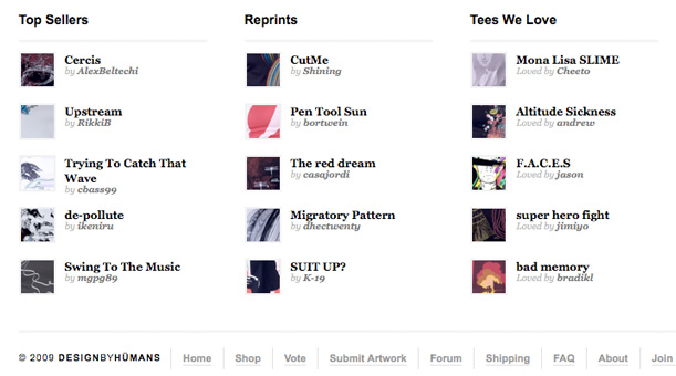
Review all observations and goals.
Many different sources will tell you exactly how and what to do within a home page. Take all of these into consideration for your specific market. Outline what you think is of significant value, what your competitors have done, and what visitors have implied to obtain an insight to every side of the spectrum. From there draw out your plan and address goals.
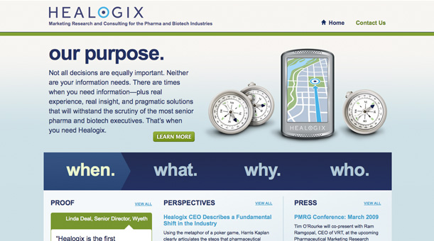
Think about what critical material to display.
It is entirely possible that your website has so much going that it is hard to pick out what exactly should be put on the home page. Finding a right balance between organizational goals, branding, and user experience can prove to be an issue for even the most prestigious. Review all of your objectives and have a plan to address all of the critical material.
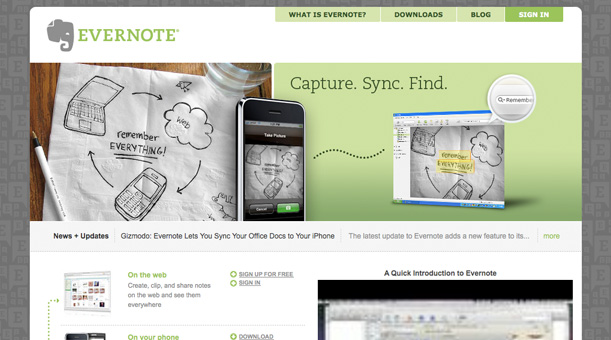
Keep navigation traditional and unmistakable.
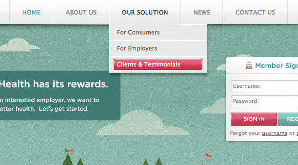
When visitors come to a home page they want to feel like they are in charge and any doubt that they are not will mostly likely have them leaving the page. One way to give visitors complete control is to allow them to navigate the page and site, however they please. This is easily accomplished by providing a traditional and unmistakable navigation. Most popular and distinctive locations for navigation are across the top, down the left side, or both combined.
Provide a site map and search capabilities if possible.
It is not uncommon for visitors to want to a search capability instead of learning how to navigate the site, especially with search engines being so popular. Google offers a free local site search that can greatly benefit any site. Another method of navigating a website is through a site map. Not only will the site map help users see where they are and where they can potentially go, but it will also help with SEO practices.
Set up foundation details.
Setting up foundation details on the home page will allow visitors to recognize these details throughout the rest of the site. These details may come in many different variations, for example all links within the site may be one font type, size, and color while all of the headings may be a different font type, size, and color. These foundations make it easy to recognize exactly what visitors are looking for and how to ignore the rest.

Initiate personality.
A lot of times organizations try to keep home pages simple and free of a large portion of text. What text that does go on a home page needs to contribute to the personality of the site and the organization’s character. Remember, having a good amount of text (at least around 350 – 500 words) with appropriate headings on any page will benefit SEO purposes.
Are you a manager? Looking to actively engage with your employees?
Let Lead Honestly help get the conversation started by sending you five questions to ask your employees 1-on-1 every week.
Be a Better Leader