Multivariate testing (MVT), testing multiple elements of a live web page at a time, is becoming more and more popular amongst the web design and development community. Understandably so, multivariate testing allows you to test a large amount of combinations and see exactly how those combinations stack up against one another. You will quickly find out that the smallest changes can produce the biggest results.
What elements should you test?
When deciding exactly what elements to test within a multivariate test you are going to focus on the call to action. Determine what you want users to do upon landing on a page and then outline all of the key elements in and around the desired call to action. Any element a user will have to interact with to complete this action is an element you are going to want to run the multivariate test with. A few of these elements may include:
Brand Awareness
Depending on how popular, or unpopular, your brand is may impact conversions. If you have a well-known brand it may help encourage conversions where an unknown brand would not. On the other hand, having too much brand presence on a page may get in the way of users trying to complete a conversion. Figure out what you would like to accomplish with your brand awareness and then test it.
Headings
Headings are the first section of text a user will read on a page and if they like it they will continue on. Perhaps they will continue reading, maybe they will scan the rest of the elements surrounding the call to action, or if you’re lucky they just might jump straight to completing the desired call to action. Either way, testing different headings will allow you to determine which has the best positive outcome. Not too sure headings can make that big of difference? You do not have to take my word for it; 37signals have had significant results all from testing headings.
Text Content
Not every user is going to read the text content surrounding a call to action, however those who do are only going to be interested in helpful and useful content. Creating a few different blocks of text to test against one another can give you an insight as to how your users think and what will work best with them moving forward. While you may not see a very sizable difference in your conversion rate from testing text content you will gain a tremendous amount of awareness.
Images
The eye is naturally drawn to images on a page, especially striking images. How you present your call to action can be dramatically affected by the images used around it. As an example, if you are selling an e-book that is to be downloaded, try using an image of an actual book against an image of a PDF icon. You may be surprised to find that your users like to see a tangible product over a file icon. The right image or images can work wonders on your conversion rate.
Buttons
Buttons may very well be the most important part in completing a call to action. Simply put, buttons are one of the easiest ways for users to take action, an action that is often important in determining the overall success of a website. Does your button actually look like a button? Is it instinctive and easily recognizable? Put together multiple button combinations and test them against one another. It may take a few different tests, but soon enough you will have a shinning star.
How should you test these elements?
Within a multivariate test you will need to visually design multiple combinations of the elements surrounding a desired call to action. I recently wrote an article, 4 Simple Design Elements Behind a Good Call to Action, which goes into great detail on how to visually craft a strong call to action using size, shape, color, and position. Using size, shape, and color, you are able to create an extensive array of elements to test, all of which will help lead you to the preferred conversion rate.
Size
The larger you make your call to action, the easier it is to recognize. Furthermore, the larger an element is the more importance it will signify. You want to find a good balance between how large your headings and images are as compared to your button. Headings should not be so small that they do not stand out over the other copy, meanwhile a button should not be so large that it is the only item on the page.
Shape
A good call to action will use shape to its benefit. Make the corners on your button rounded so that it looks more like a button and instinctively clickable. Use an arrow or another object to draw attention to the button. Do not be afraid to break a grid in order to make a call to action stand out. On a page full of straight lines the curved one is sure to stick out so use shape to your advantage.
Color
Every color is going to catch a user’s attention a little differently. Additionally, each color is going to provoke a different emotion for each user. One of the biggest things you can test, and continually test, is the color of your headings, buttons, text, and so forth. Honestly, the options are endless! Test and work with colors that will standout, provide a high contrast, and encourage users.
Position
Logos are commonly found at the top left of a page for a reason, it is where they are most easily recognized and successful. Position plays a very important role in gaining conversions. How does your call to action perform placed within the left side of the page as compared to the right side? In addition to that, how does your button perform on the top of your call to action as compared to the bottom, left, or right? The position of your call to action needs to be in an instinctive location and clearly obvious to your users.
Multivariate Testing Example: Smashing Magazine
I recently wrote a review on The Smashing Book and in doing so I was visiting the Smashing Magazine website quite a bit. I started to notice that they are running a multivariate test on how they advertise the book to their visitors. Outlined below are a few of the different examples and combinations I was able to identify. I do not know how well each of these is performing, nor do I know anything about the parameters of the test. I would love to hear more about the test if Smashing Magazine was to share. Maybe they will release a post about it sometime in the future (wink wink)?


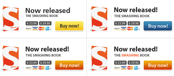


The multivariate test by Smashing Magazine is a great example of a multivariate test as it is testing a wide array of elements. The test does a fantastic job at testing the brand, headings, text, images, and buttons. In doing so, they often change the size, shape, color, and position of different elements. There was a decent amount of planning put into this test and it is obvious that Smashing Magazine knows what they are doing.
Are you a manager? Looking to actively engage with your employees?
Let Lead Honestly help get the conversation started by sending you five questions to ask your employees 1-on-1 every week.
Be a Better Leader