Forms are the biggest areas of abandonment on the internet. Reason being they are boring, ask for too many personal details, and are only a step toward the end. However much of the internet is widely based around forms including everything from login to contact forms and online purchase to social networking comment forms. All in all the more satisfying forms you design and the easier they are for users to complete the better results you will see.
Forms are supposed to be practical and serviceable, not an artistic expression. The main purpose behind designing a form is solving a problem including how to get users to input their information in the easiest way possible. It is not to say that forms should not be pretty, they should. It is all a matter of putting everything together. A few suggestions to follow when putting together a form include:
Acknowledge common form goals.
The main goal for any form is to be filled out and submitted. Different forms will have different specific goals, for example a newsletter subscription form has the primary goal of obtaining marketing information, especially an email address. Be aware of the forms broad and specific goals.
Be aware of, and address, visitor’s questions.
While some forms are easier than others to complete, they all provoke questions amongst visitors. Knowing where to start, how long it will take to complete, and if the questions are fair are all questions that will arise. Knowing what questions may be asked allows you to answer them now and allows more users to complete the form.
They can look strenuous.
All too often forms look strenuous and typically not worth the effort. If you are requiring users to input a large amount of information make sure that the end result is worth the effort.
They can get lengthy.
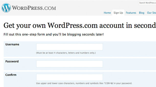
Limit the number of fields within a form as much as possible. For each additional field required a decent percentage of users will abandon the form. Keep forms sleek and omit the nonessential fields.
They are rarely straightforward.
Forms are rarely straightforward and all too often they are spread out across multiple web pages teasing visitors the entire way. You will accomplish the best results if your form can be completed on one page with one submit button, getting straight to the point.
They can stop working.
There are no guarantees that a form will always work correctly. With so many moving parts, all-relying on the other, it is not uncommon for forms to stop working. Keep a close eye on your forms and ensure that they are always working to their full capability.
Center user focus on the form.
The best way to get users to fill out a form is to make it stand out on the page. Doing so will allow users to find the form quickly and thus fill it out quickly as well. For best practice use a light background color for the field so that the text is easy to read, however stylize the form with a border, arrows, field box colors, and so forth.
Implement a well-defined design.
A well-defined and clean layout will make the form easier to understand and subsequently easier to fill out. A few tips on designing around a form include using enough white space, removing anything that will not contribute to the completion of a form, using left-aligned text and fields, and having easy to read content.
Cut out nonessential fields.
A widely known rule states that the more fields you have the less chance of completion you have. As a designer, negotiate with a client to come to a safe number of fields and remove the fields that are unnecessary and irrelevant.
Provide advantages for users.
If a user is filling out a form there needs to be a strong motive behind it, and in general the bigger the form the bigger the motive needs to be. Do not let visitors forget the advantage they are going to receive by completing a form, especially if they happen to get distracted.
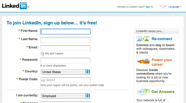
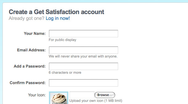
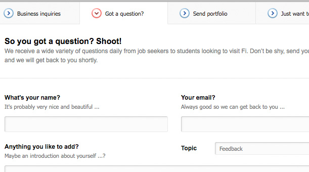
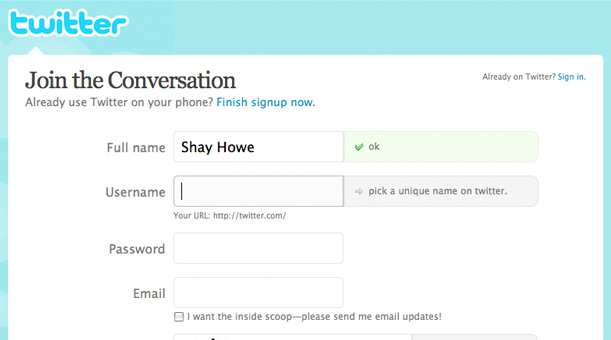
Make use of understandable and detailed labels.
Writing understandable and detailed labels is easier said than done. Common fields such as first name, last name, and email are easy however asking users for a username can cause some difficulty. Is this a new username, an alias, or an email address?
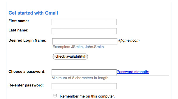
Use verbs if practical.
If you are afraid that users may not understand what is being asked of them, consider using an active verb within the label. For example, instead “Password” use a label with an active verb such as “Add a Password”.
Use sentences or sentence completion if practical.
When using an active verb is not enough and you need more detail to communicate the question consider using a complete sentence, complete question, or the beginning of a sentence. Examples include: “List your favorite colors.”, “What is your name?”, “I am currently:”
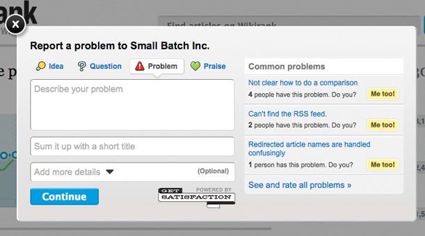
Show tips and help.
There is no doubt users will have questions when filling out a form and if no one is around to help them it can be a deserted experience. Providing users with tool tips and help icons can be of great use and ultimately allow them to complete the form. Having your tips and advice pop up in new windows or off to the side of a form is not ideal as too much content on a page may confuse visitors. Only show users a tool tip or help box when the users select each individual field or when they ask for it.
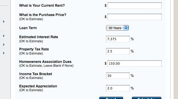
Permit approximate or estimated fields.
Some forms may require some detailed information not readily available to the user. This is a huge roadblock and will mostly likely stop any further completion for the user. If an approximate or estimated answer is allowed make this clear to the user.
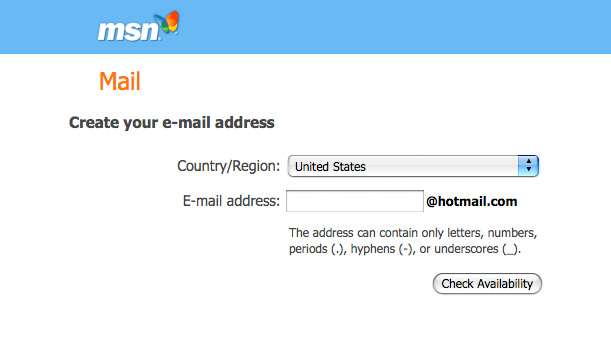
Answer all possible fields for users.
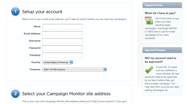
The faster you can move users through a form the better results you are going to have. Prefilling and answering all of the possible fields for users ahead of time will dramatically speed up the process. If you already know the majority of the users are from the United States this could be as simple as selecting the country for them within the address field.
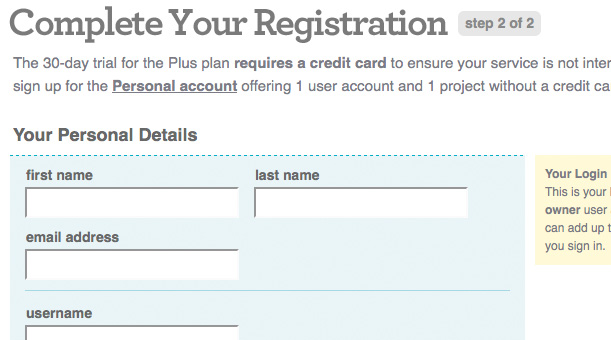
Supply progress or steps guide.
If a form is going to span across multiple pages, show the progress or steps involved. Doing so allows users to see the end and know that they are not being lead down a long and lonesome road. Research shows that users are more likely to abandon your form when not knowing where the end is.
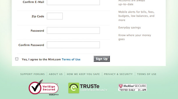
Provide users with confidence and security.
Viruses, spam, fraud, and theft have spread like wildfire. Users are aware of this and thus are reluctant to give out any of their information, including something as simple as their email address. If possible purchase the VeriSign and TRUSTe stamps for your forms, if not a simple line of text reassuring users that their information is safe and secure may work as well. Users have grown to look for these stamps and icons, having them will only provide them with added confidence and security.
Are you a manager? Looking to actively engage with your employees?
Let Lead Honestly help get the conversation started by sending you five questions to ask your employees 1-on-1 every week.
Be a Better Leader