The checkout process has become widely known over the years on the internet and making purchases online is fairly common for most households. With such popularity you would think the checkout process has been nearly perfected, however astonishingly 59% of all users abandon the checkout process. This could be for a number of reasons but the most important being users are not given a clear direction through the process. This leads users to get confused, frustrated, and abandon the process. Ideally an easier, friendlier, and dependable checkout process will do the trick and increase conversions.
Checkout processes are fairly dynamic and span across multiple pages. Making a change to one step may affect another. While designing a checkout process it is important that you take all of the steps into consideration and design the checkout process all the way through, not skipping any steps in-between. A few design suggestions to take into account include:
Acknowledge common checkout process goals.
While the checkout process is most commonly used for the exchange of money for goods or services, it can also be used to accept donations, take membership payments, or to even transfer money into a virtual equivalent. Make sure you know the primary goal and function of your checkout process.
Be aware of, and address, visitor’s questions.
When completing a checkout process users need comprehensible direction and answers to any questions that may arise. A few questions to be aware of, and provide answers to, include: “Where do I start?”, “How much will shipping cost?”, “What payment methods are accepted and are they secure?”
They have a troubled past.
The checkout process has a deep and rigorous past including some elements that are now dampening its future. For example, it used to be helpful to have users create an account when making purchases for order fulfillment. This is no longer true. If using an out of the box checkout process for free make sure that you disable or remove many of these unnecessary features.
They can stop working.
The checkout process is developed within hard code connected to a database. Problems can, and often do, arise. Since the checkout process is vital to the outcome of a website be sure that you have the proper facility in place to monitor the process, ensure that it is working and looking for any potential issues.
They are rarely straightforward.
Sometimes checkout processes will jump from one website to another confusing users along the way. With all of the identity theft and security risk on the internet this will turn away users. If you need to use a separate or third party site for the process that is fine, but do so smoothly and securely.
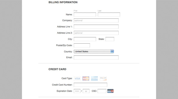
Follow form fundamentals.
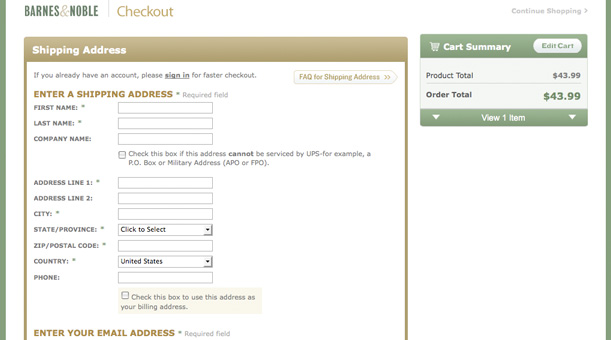
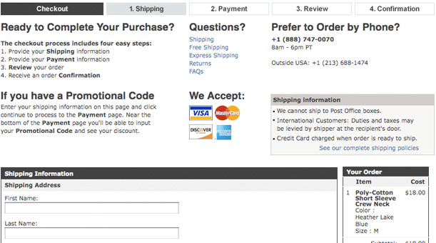
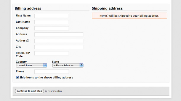
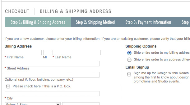
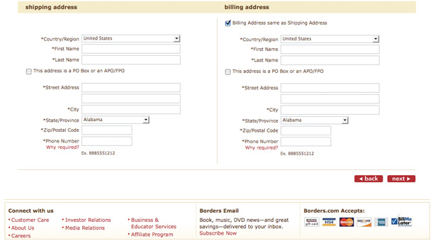
The same design guidelines for forms apply to forms within the check out process. Some of the most important guidelines being: Cut out nonessential fields, center user focus on the form, show tips and help, supply progress or steps guide, and provide users with confidence and security.
Remind users what is in the cart.
Believe it or not many users will forget what they have added to their shopping card and other users just want to double check their items to ensure they choose the correct size, color, etc. Giving users a thumbnail image, clean heading, and small details on the products in the shopping cart will allow them to view what they have selected without having to leave the checkout process.
Place buttons within a hierarchy.
Many out of the box shopping carts will give the same amount of attention to the clear cart button as the check out button, all the while using confusing labels. Keep your buttons organized with descriptive labels, intuitive placement, and intelligible visual design.
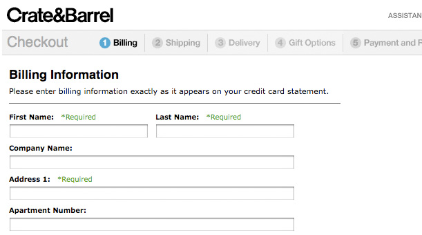
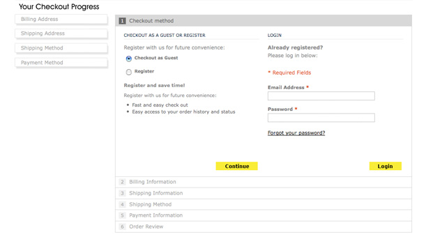
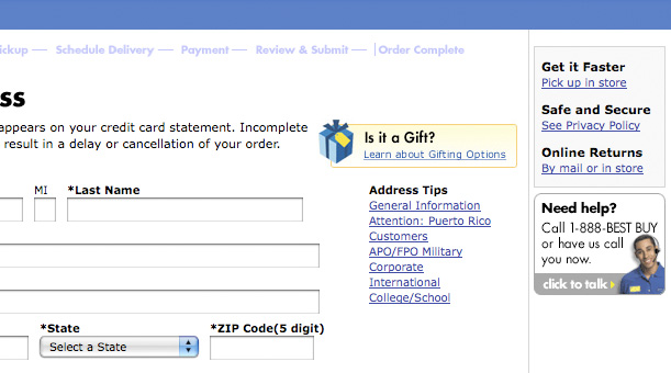
Supply progress or steps guide.
Letting users know where they are within the checkout process is vitally important no matter how many steps are involved. Users are at ease when they know where they are, where they are going, and exactly how much longer the process may take.
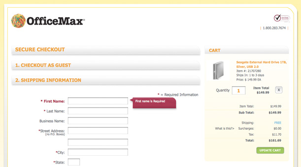
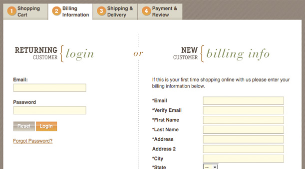
Omit user registration.
The largest abandonment rate within the checkout process occurs when users are required to create an account or register with a website. If it is necessary for users to create an account to complete the checkout process integrate it within the process itself. This stops you from having to ask users for the same information repeatedly and will decrease your abandonment rate.
Minimize and clarify process.
The fewer fields required completing the checkout process the more conversions you will see. However it only takes one confusing step to throw a wrench in the whole process. Minimize and clarify the checkout process at the same time, ensure only necessary information is being collected and that nothing is being left out or overlooked.
Complete within one page if possible.
The easier the checkout process is to complete the better. If you have the option or possibility to complete the entire checkout process within one page do so as it will boost conversions. Gathering all of the needed information within one page can also be simplified using Ajax, jQuery, and the alike to stylize the process.
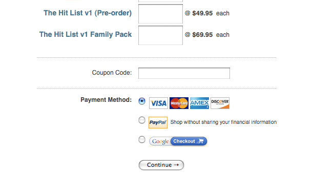
Provide users with confidence and security.
As with any form, and even more so with the checkout process, you want to provide users with a strong confidence and security. To accomplish this place a stamp, seal, or icon within the checkout process that verifies all security measures. If possible have this stamp, seal, or icon linked to detailed security information or privacy policy — perhaps in a pop up window if applicable to keep users within the checkout process.
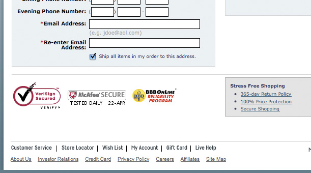
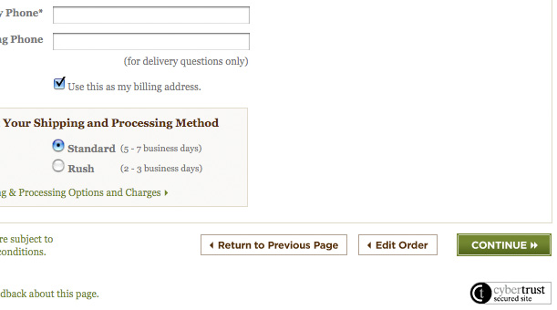
Display shipping and return policy details.
More times than none users want to know what are the shipping and return policy details. Their questions arise as what to do if a product is faulty, broken, or even just the wrong size. Providing shipping and return policy details will ease users and allow them to easily make the desired purchase.
Are you a manager? Looking to actively engage with your employees?
Let Lead Honestly help get the conversation started by sending you five questions to ask your employees 1-on-1 every week.
Be a Better Leader