Category pages are often disregarded because cleverly produced ones are passed through almost immediately directing visitors to the desired product. Category pages are an important step in the conversion process as they are in charge of providing a brief overview of a large amount of items and furthermore providing a way to decipher the difference between all of the items. Ultimately they lead visitors to the detail page where the conversion is finally completed.
Category pages act as a critical link to the conversion process and clutter and confusing design can break the chain. A few simple measures to think about when working on a category page include:
Outline detailed goals and guidelines.
The ultimate goal of the category is to progress visitors to the detail page. In doing so visitors are going to look for a few things, including: Displaying items in a pleasing manner, supplying enough details to differentiate items, contribute a way to scan items by various specifications, and furnish a way to move to the detailed page or next step.
Be aware of, and address, visitor’s questions.
After landing on a category page there are different questions a visitor may have. A few questions that are important to address include: Have I chosen the right category and is this what I imaged to see? Are the items sorted in any particular order and how can I rearrange them? Are these all of the items within the category and if not how do I see more? Is it possible to narrow the list or widen the list? Is it possible to buy this item immediately?
Build categories to visitor’s preference.
When building category pages build the pages in a logical manner that supports how visitors think. Instead of going off on a category tangent decide if there needs to be subcategories and so forth. One of the best ways to decide what categories to use are to follow that of a prosperous physical or offline store.
Use prominent category titles.
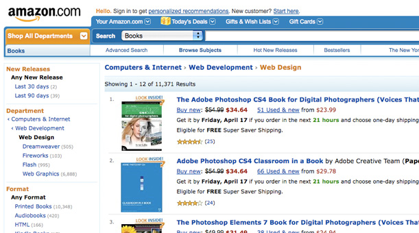
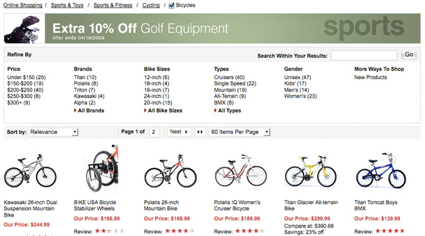
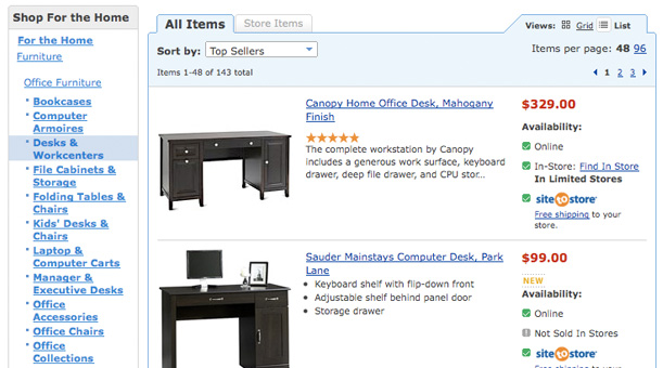
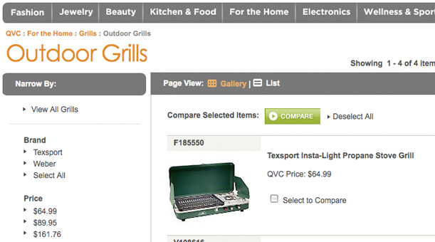
Use big and clear titles on category pages. If a person clicks on “Men’s Jeans” having a substantial title on the category page saying “Men’s Jeans” will reassure them they are in the right place. If they clicked on the wrong category it lets them know they are in the wrong place before wasting too much time.
Visually clarify the category layout and individual items.
The call to action of a category page should be the individual items. Layouts need to be designed in a way that the products are visually distinctive from the other elements of the page (navigation, promotions, etc.). Furthermore individual items need to be clearly identified, if a customer cannot tell the difference between two items they will leave.
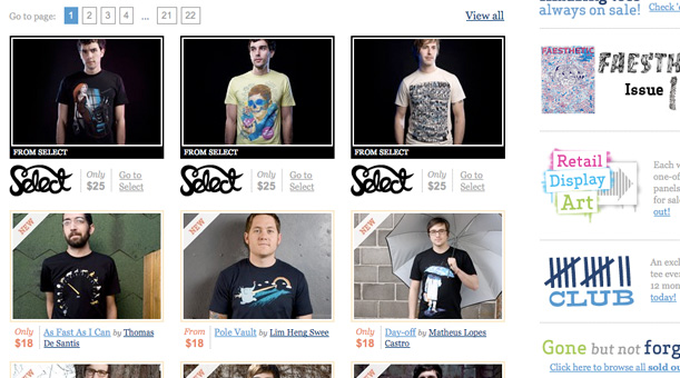
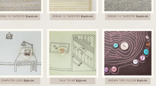
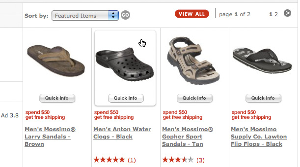
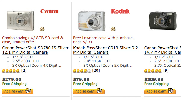
Utilize simple and enjoyable pictures.
The first time a potential customer sees your product online is most likely from a thumbnail image on a category page. Therefore, it is immensely important that you use simple and enjoyable pictures.
Provide thumbnail images sizable enough to see the product.
When placing your simple and enjoyable thumbnail images on a category page make sure that they are large enough to distinguish what the image actually is. Shrinking and cropping images too much often makes them blurry and unrecognizable. Use large thumbnail images and put 15 well-organized and clear products on a page rather than 30 tiny and distorted products.
Edit thumbnail images for significance and definition.
It is not always necessary to include the entire original image in a thumbnail, especially if the image is not completely of the item itself. When creating thumbnails, use parts of the original image that are most recognizable or have the most significance and definition to the actual item.
Make thumbnail images links.
Make thumbnail images links for a few different reasons including: Visitors presume images are links. Images are easier to click on than text. Images do not require any reading to comprehend what is on the potential subcategory or detail page.
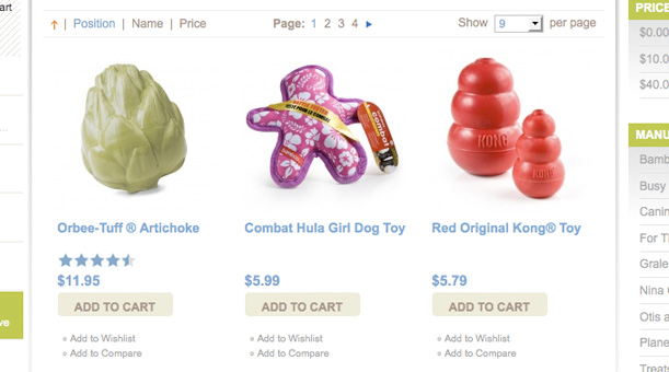
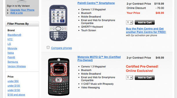
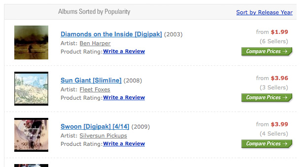
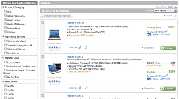
Provide sufficient display, search, and filtering options.
One of the main purposes of a category page is to allow visitors to search and filter through different items. Providing them with the tools and options to do so will increase the chances of them finding what they want as well as them making a purchase. Different types of items can be filtered in different ways so make sure to put some thought into the options you provide visitors for searching items.
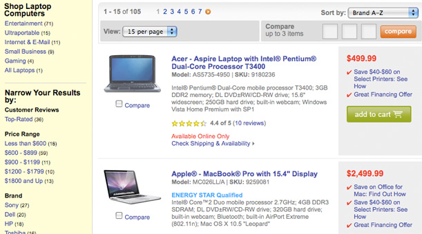
Supply price comparison options.
This will not work for all sites, however for the ones it does it provides leverage. Supplying a price comparison will allow visitors to see your cheapest products (hopefully not scaring them away) as well as strengthen your sale items. It would also be a shame for you to lose a customer because you do not supply a price comparison option and your rival does.
Leave out valueless details.
A lot of people want to throw out as many details about a product as possible feeling it may boost a visitor’s opinion of that product. The truth be told, less is more. Visitors want to be able to quickly scan products and limit their options and providing extraneous information will only slow them down. Ideally product name and price is the best way to go if possible.
Use an “Add to Cart” button if feasible.
If an item is distinguishable, uncomplicated, and requires little to no explanation using an “Add to Cart” button on the category page will increase conversions. However, this is not always recommended and could clutter a category page if not used correctly. Expensive, complicated, and detailed items need to reinforce detail pages before a committed call to action.
Do your best to comprehend visitors.
Often times the best category pages are the ones that truly comprehend visitors. It is to your benefit to do extensive research and find out exactly how visitors shop for your product and then design a category page around them.
Are you a manager? Looking to actively engage with your employees?
Let Lead Honestly help get the conversation started by sending you five questions to ask your employees 1-on-1 every week.
Be a Better Leader